When you’re faced with creating a logo that has abstract meanings finding your way can be difficult. Jeff and I went through this process for Liquid Minded’s identity. With good people, a lot of communication, and some guess work you too can find your way from the abstract to a concrete image.
[Liquid Minded](http://liquidminded.com), a product which helps its users achieve a “mind like water” state. As an abstract concept it has a lot of potential, but how do you express the idea as a symbol? The [meta](http://en.wikipedia.org/wiki/Meta) concepts called out to us but putting much of an identity to it was difficult. When we went through the creative process with [Nuance Labs](http://nuancelabs.com/2007/02/17/the-magic-of-hicksdesign/) the idea felt more tangible: a skunkworks environment–lab, mad scientists, world domination–is easy to visualize, right? Well, maybe that was just me.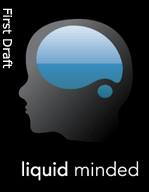
The job went again to [Hicksdesign](http://hicksdesign.co.uk). Jon felt some connection early to the idea so we let him run free. We’ve learned as artists ourselves that being boxed in early with concepts can sometimes be a hindrance to creativity.
Making a mind map was one of the most critical things we did for the process. It let us explore a wide range of ideas that made up the concept. The exercise also acted as a conduit with which Jeff and I could iron out what we thought it meant. Any conflicts in image were resolved in this process and we were able to unify our conceptual vision.
A deluge of ideas were presented to us for the second iteration. We were shown 15 designs that explored liquid natures. I printed off a few copies which allowed Jeff, myself, friends, and family to have conversations about them.
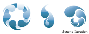
The discussions were productive. When you ask a bunch of different people an opinion you rarely get consensus but you do find overlapping areas of likes and dislikes. It took us a week to come up with a response. At first, we saw some potential but couldn’t really verbalize what needed to change; nothing really struck a resounding chord. We tallied what those around us had said and explained our disconnect but trusted that Jon would find greater traction on the next iteration and let it go.
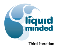
The pieces began to fall together in the third round. Before, we had no idea where we would end up. At this point, we started to have hope that we might achieve all of our original goals. We were quite excited. While we knew we were on to something, Jeff and I still had some differing opinions on where to take it next. I saw that the logo could have two to three separate pieces for utilizing in different contexts and enjoyed the organic feel of the typography. Jeff protested the squishy nature of the text, ascribing it to a “Disney”-like feel. After a round of talks we came to an agreement to see if Jon could tighten the text up a bit while remaining organic and if that didn’t lead us in the right direction to head back to the Nuance Labs font family. You have to be willing to travel a bit down differing avenues.
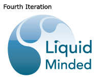
The avenue I was trying for didn’t really pan out. It was kind of suspected, organic constraints are hard to pull off. Jon did his best to represent some alternate text choices but none of them were “right” enough to work for us. The image side of the logo, however, was really hot. Without any dissent Jeff and I fell back into a font family that linked us to the Nuance Labs brand with a little stylish addition of the water dropped ‘i’. Letting go of something that isn’t working is also important. You can waste a lot of time and energy trying for the intangible. It’s better to turn your energies towards what is working and run like hell.
Jon was as excited as we were and wanted to work on an improved gradient idea. The lines were hard and he was thinking of how to soften it to better present the shapes. We knew we were near the end; now it was time to hone and polish.
What was delivered was jaw dropping. From ear to ear we wore grins of satisfaction. At the beginning of the process we had no idea where we were destined to end up, and yet we could not have been happier with the outcome. Lessons learned? You have to be willing to keep the conversation going, draw out your inner thoughts through whatever means necessary, and stay open minded enough to see it through to the end.
The Liquid Minded logo has a lot of available variations just as a liquid concept should. It also plays well with the Nuance Labs design dancing in complimentary colors and shared traits. We are proud to unveil it to the public and hope you enjoy it as much as we do.
[Liquid Minded](http://liquidminded.com) is a registered service mark of Nuance Labs, Inc.


Cool logo… I’m thinking this could be next years hot headgear item!
Are we not men?